Adaptive UI · Product Design · Shipped
What if the interface had a mood too?
Instead of beginning with genre, Moodie begins with a feeling — and the interface answers in the same register.
Visit live site
01 — The Premise
Movies are emotional. Discovery should be too.
Every recommendation product asks the same question in a different form: what did you watch, what do you like, what's popular near you. None of them ask the question people actually ask each other, which is what are you in the mood for. Moodie starts there — not because it produces better recommendations, but because it's the question that matches how the decision actually gets made.
02 — Choosing a Mood
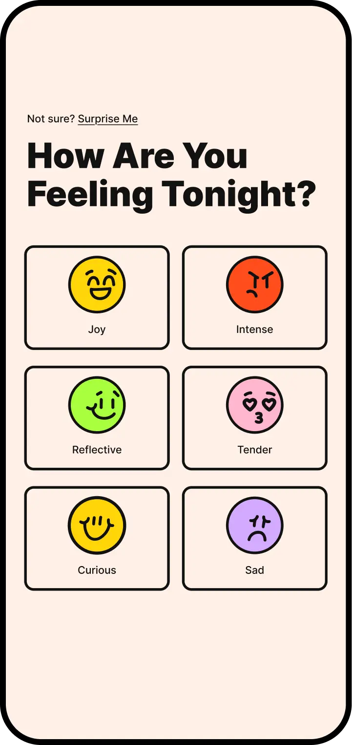
Start with a feeling, not a genre.
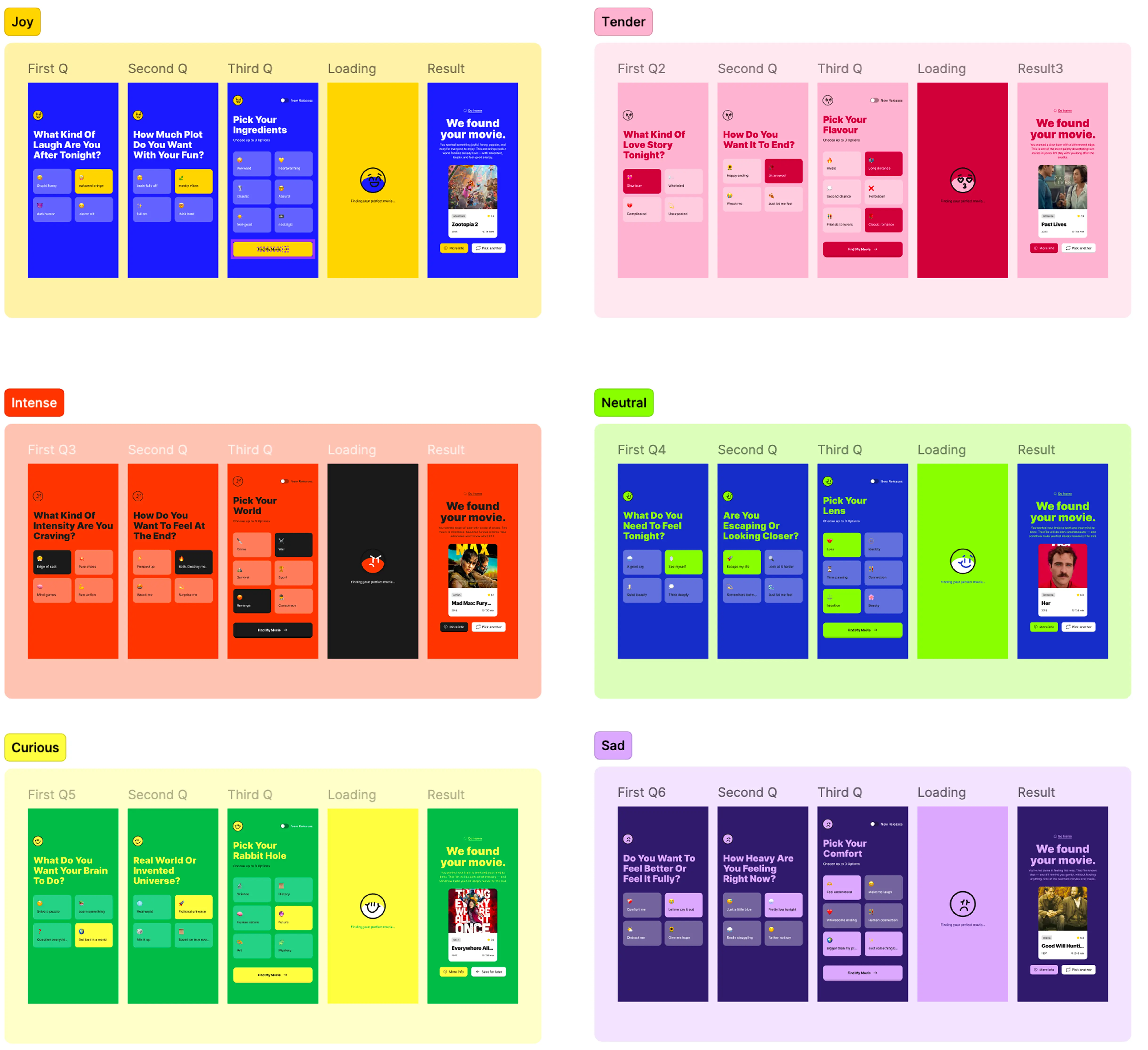
Six moods took several passes to settle. Early versions had eleven, which sounds more precise and tested worse — people stalled trying to identify the exact right one. Six is coarse enough to pick quickly and distinct enough that the choice feels meaningful. Joyful, Tender, Intense, Curious, Neutral, Sad: each one is a different route into the same catalogue.
03 — The Adaptive System
One product. Six personalities.
Structure stays familiar.
Expression changes with the mood.
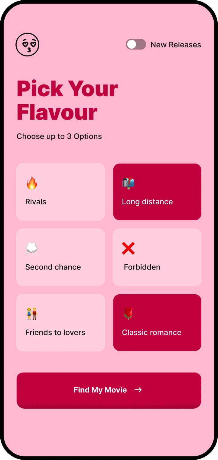
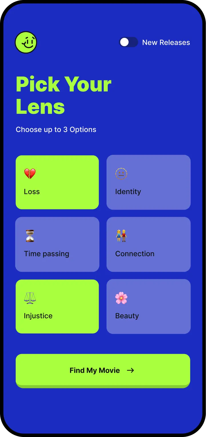
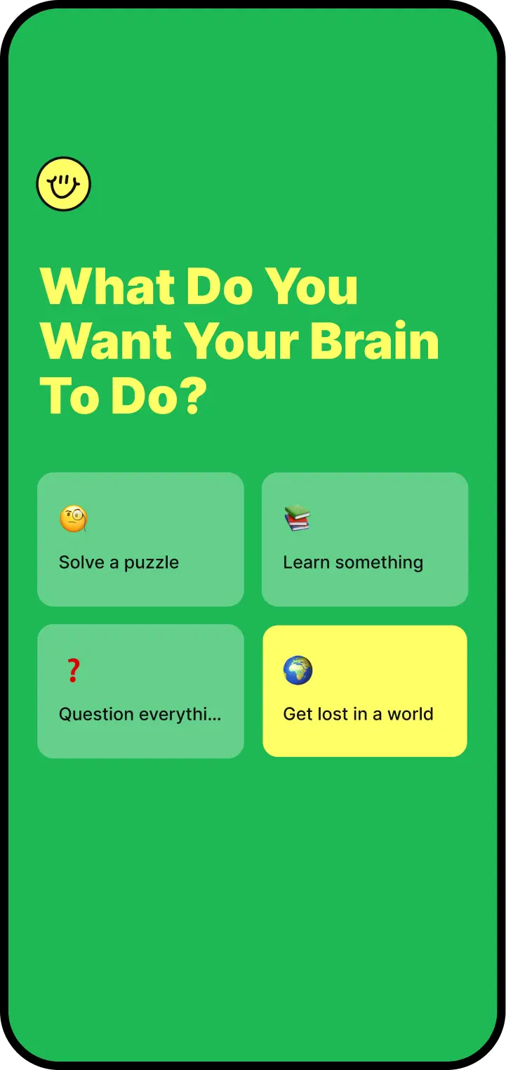
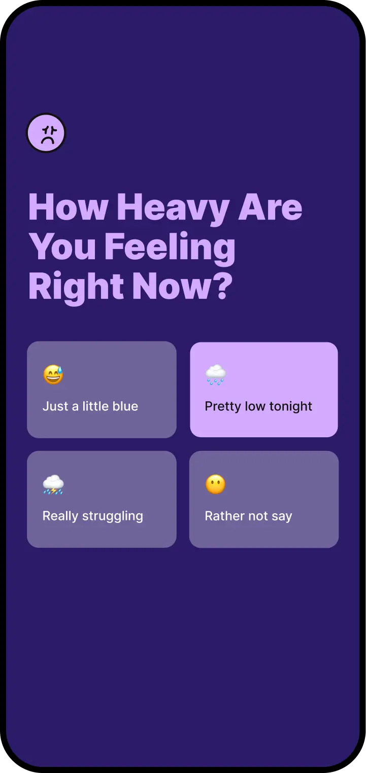
The hard constraint was that the product could not become six products. Layout, navigation, and interaction stay identical across all six moods — only colour, imagery, graphic language, and tone shift. That line held throughout: if a mood wanted to move a button, the mood didn't get to move the button. Personality lives in the expression layer, and the structure underneath stays where people left it.
04 — Discovery
From feeling to film.
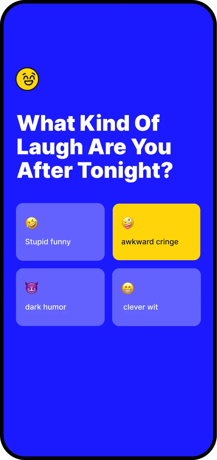
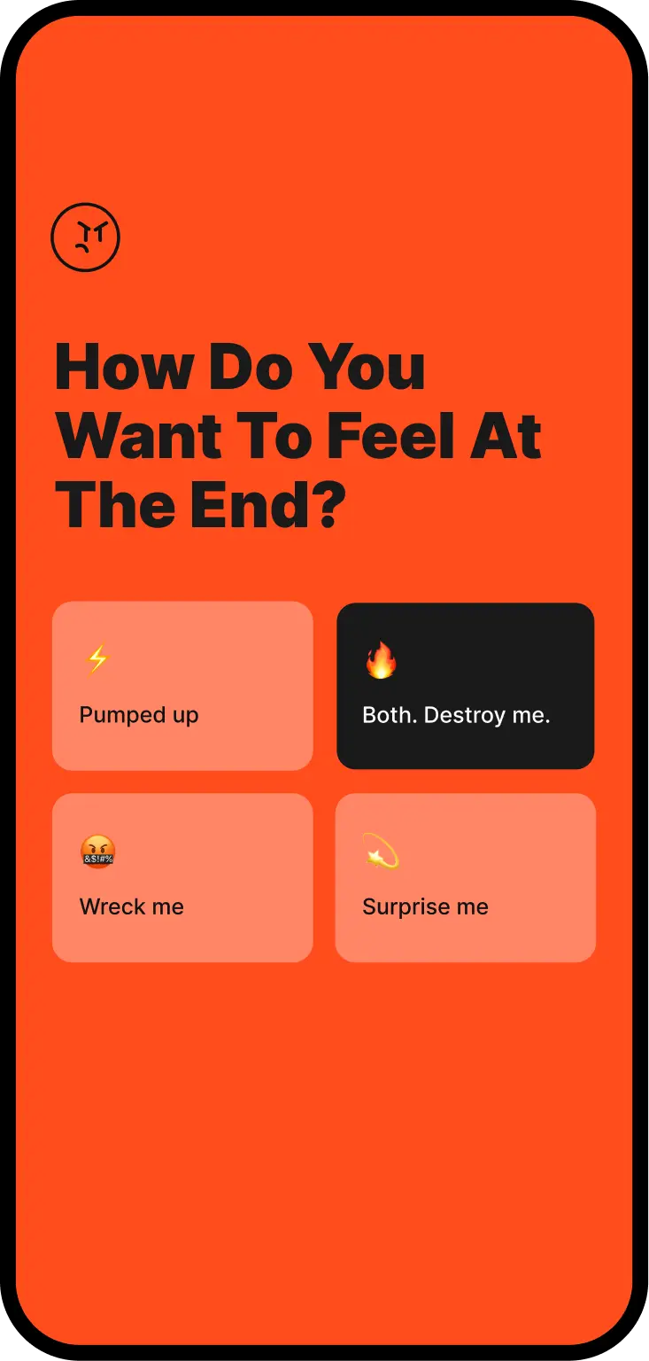
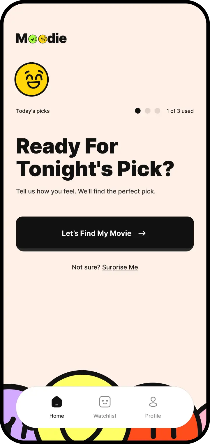
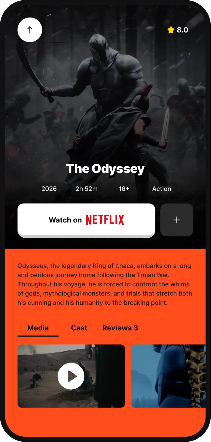
Three questions, then a recommendation. Earlier versions asked five, which felt thorough while building and tedious while using — people abandoned it before the payoff. The distance between 'I want to watch something' and 'this feels right' has to be short enough that answering doesn't become the activity.
A few lightweight choices turn an abstract mood into something worth watching.
05 — Personality in the Details
Personality lives in the details.
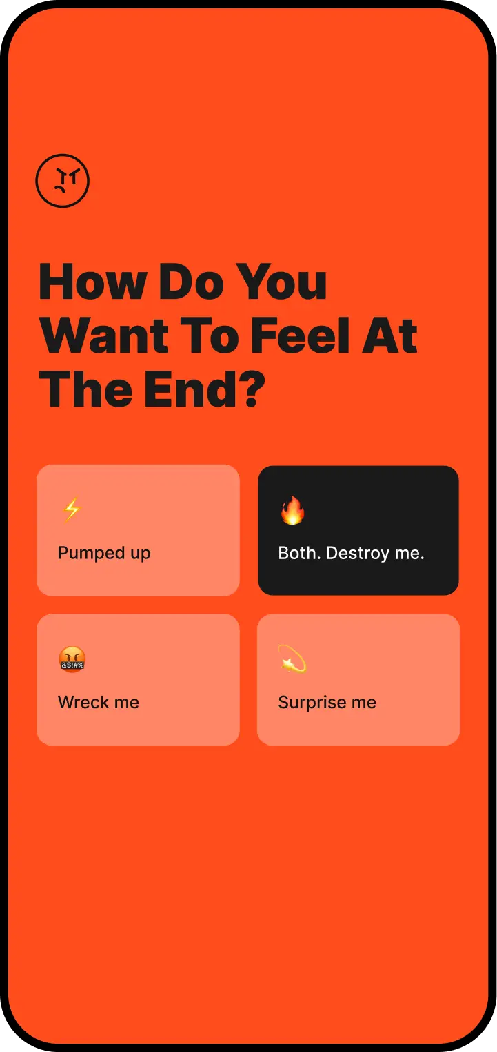
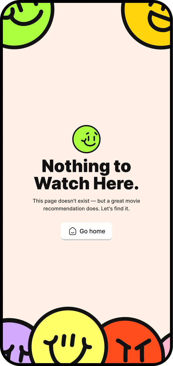
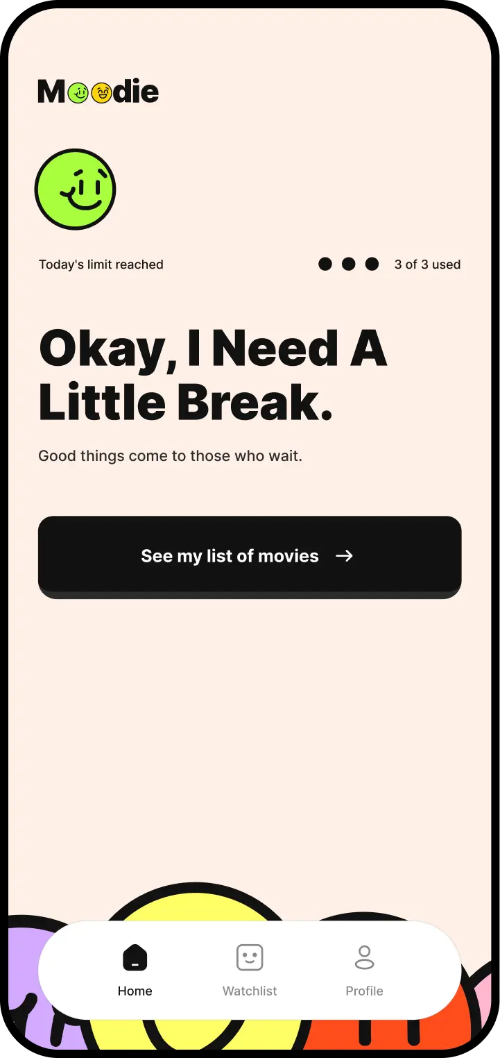
Empty states, prompts, and loading moments are where products usually revert to default and the character quietly evaporates. Because Moodie's whole premise is emotional, those were the places most at risk — an app that asks how you feel and then says No results found has broken its own promise. These screens got the same attention as the recommendation itself.
06 — Reflection
Interfaces don't always have to feel neutral.
Shipping it changed what I'd defend. Some of the mood expressions I liked most in Figma were the ones I cut, because maintaining six visual languages against real content is a cost you only feel once you're the one paying it. What survived is what earned its keep. I'd rather have six moods that hold up than eleven that need constant attention.