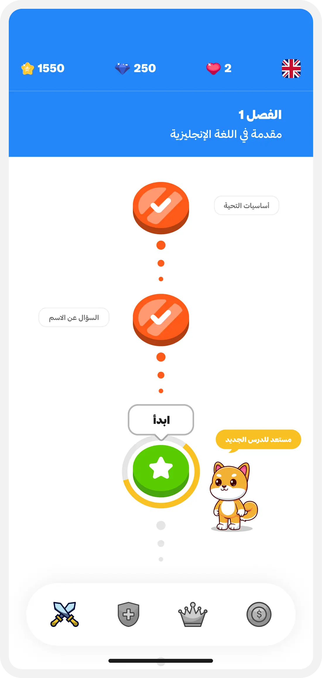
01 / CHOOSE — Pick a lesson. The path always shows what's next.
Gamification · Product Design · Product
Language learning is repetition, and repetition is where people quit. This is an attempt to make coming back tomorrow the easiest thing about it.
01 — Idea
The failure mode in language apps isn't difficulty, it's attrition. People don't stop because a lesson was too hard; they stop because there was no particular reason to open it again on Thursday. So the design question wasn't how to teach more effectively — it was how to make the next session feel like a small, obvious thing rather than a commitment.
02 — Learning Loop
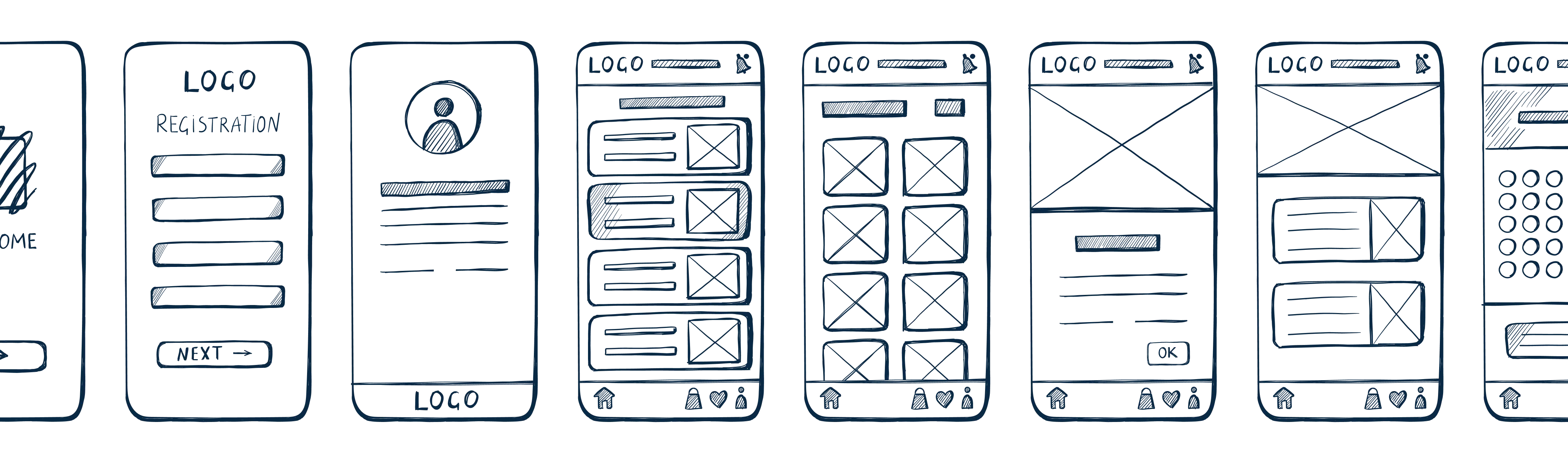
The loop is deliberately short: choose, answer, feedback, reward, progress. An early version batched feedback until the end of a set, which is more efficient and considerably worse — the gap between doing something and knowing how it went is where motivation leaks out. Feedback moved to immediately after every single answer, even though it makes the session longer.
01 / CHOOSE — Pick a lesson. The path always shows what's next.
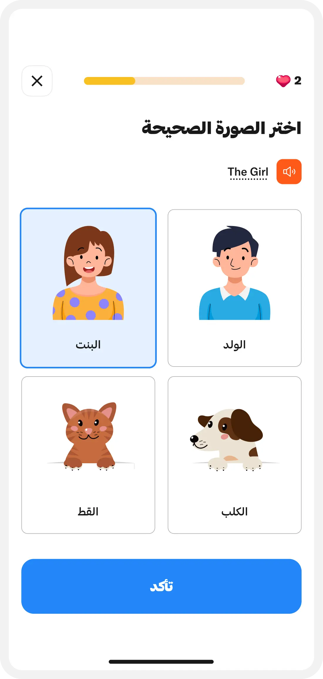
02 / Answer One prompt at a time. No sets, no timers.
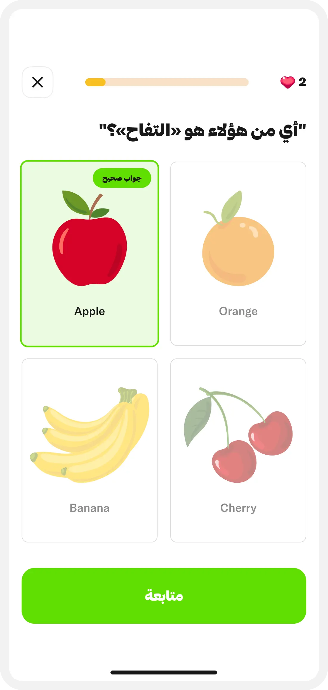
03 / Feedback Immediately, always, even when it costs a beat.

03 — Character & Motivation

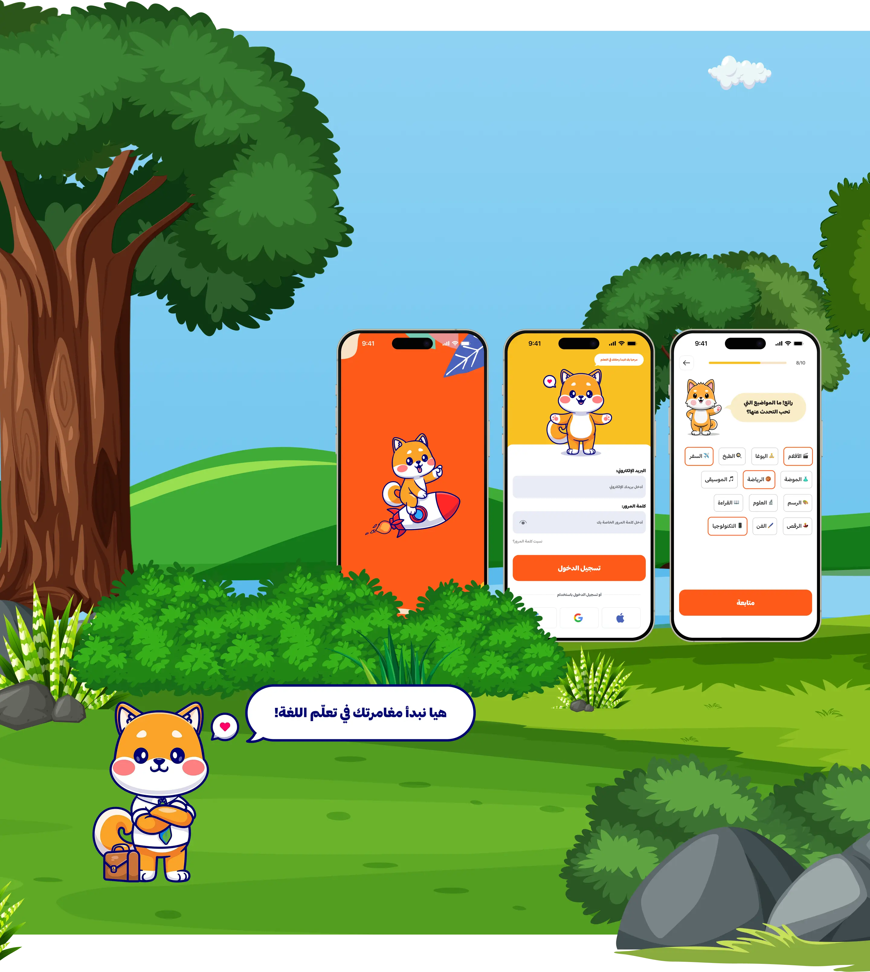
The mascot exists because someone has to deliver bad news. Getting an answer wrong is the moment people disengage, and a system message handles it coldly. A character can say try that again in a way an interface can't. It appears at three moments — arriving, failing, finishing — and stays out of the way otherwise, because a mascot that's always present stops being noticed.
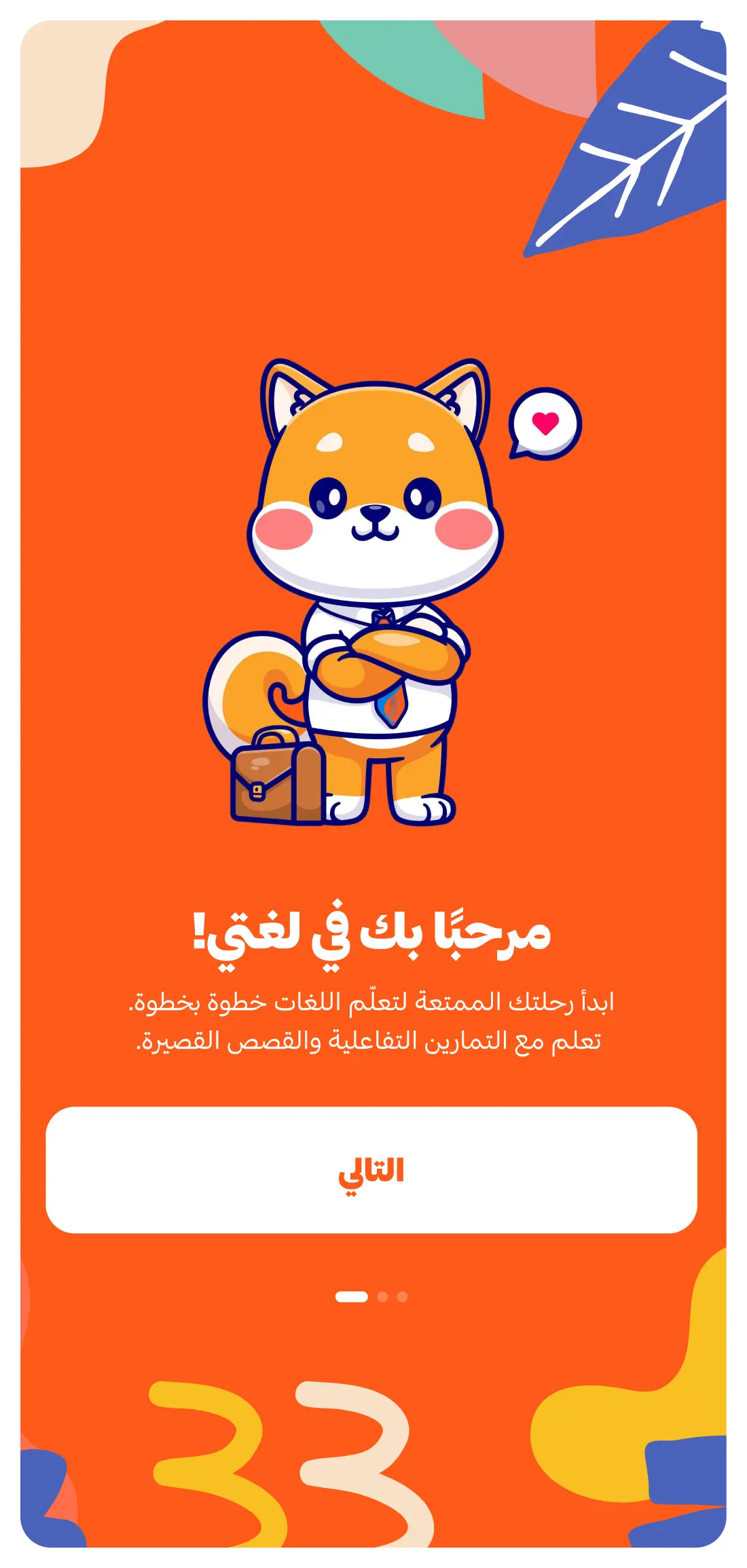
01 / Welcomes — Sets the tone before the first question.
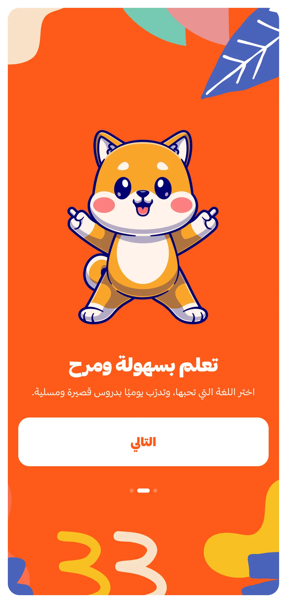
02 / Encourages — The one that matters. Wrong answers are where people leave.
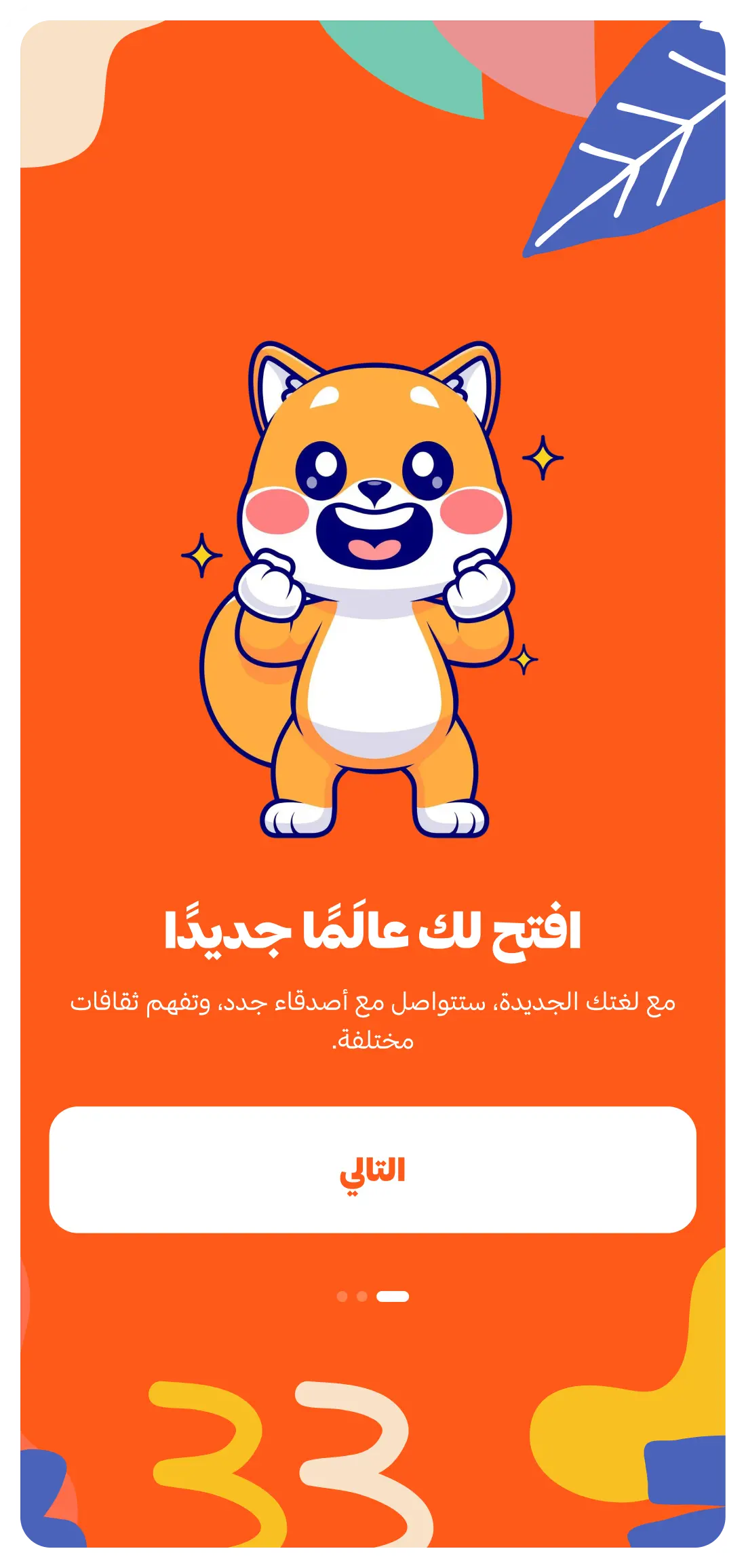
03 / Celebrates — Brief, then out of the way.

04 — Progression
Progress had to be visible without becoming the point. Streaks are the obvious mechanic and the most fragile — miss a day and the thing motivating you becomes the thing making you feel bad. So progression here is cumulative rather than conditional: a path that only moves forward, achievements that don't expire, rewards that can't be lost. Nothing punishes a gap.
01 / PATH — The same screen, read differently: how far you've come.
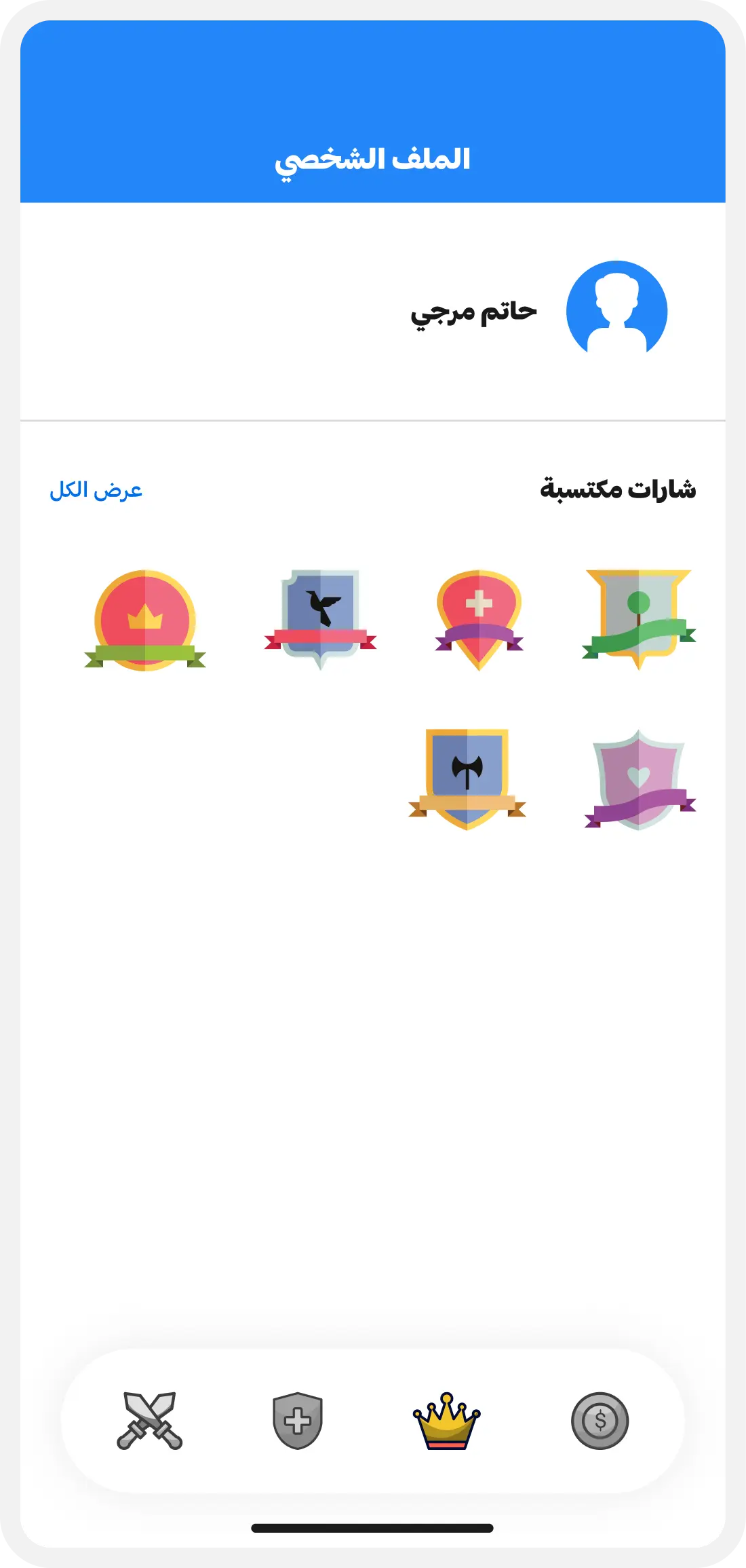
02 / Achievements — What I've done. Permanent by design.
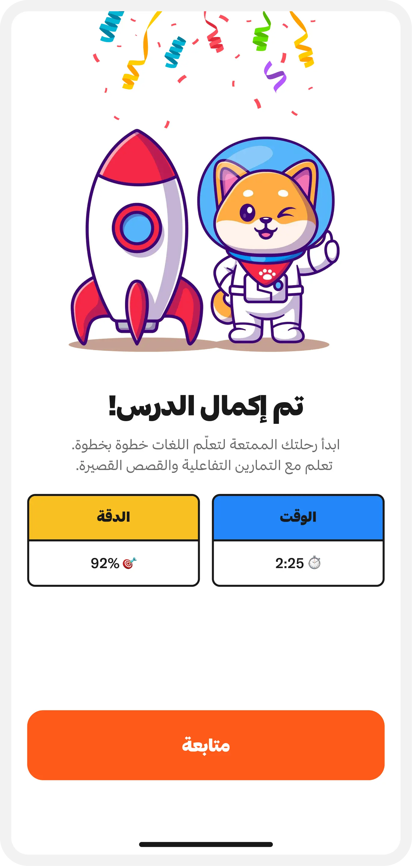
03 / Rewards — Small, frequent, and impossible to lose.