

01 / Navigation
Directional icons flip. Non-directional ones stay put.
Arabic-First · Product Design · Product
A travel product designed in Arabic from the first frame — where reading direction shapes hierarchy and navigation rather than being applied to them afterwards.
01 — Premise
I started this by mirroring an LTR layout, which is how most RTL work begins. It looked correct and read wrong. The eye enters from the right, so the element that had been a quiet endpoint in English became the first thing encountered in Arabic — and the hierarchy inverted without anything moving. Direction isn't a property you apply to a finished layout. It's the order the layout is built in.

Arabic UI components
Mirroring gets the position right and the emphasis wrong.
02 — Discovery & Navigation
The temptation with Arabic-first work is to redesign everything, which mostly produces an interface nobody knows how to use. People already know how travel apps behave — tabs at the bottom, cards that scroll, categories across the top. I kept those behaviours and rebuilt only what direction actually touches: where the primary action sits, which way progress moves, what the eye meets first in a card. Familiar structure, reconsidered entry point.

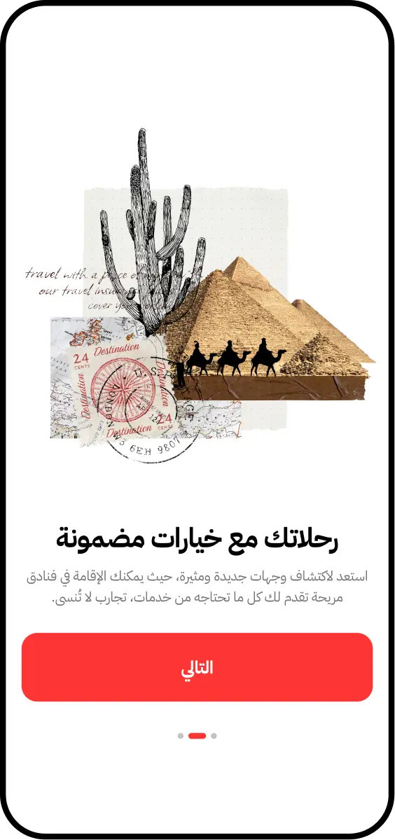
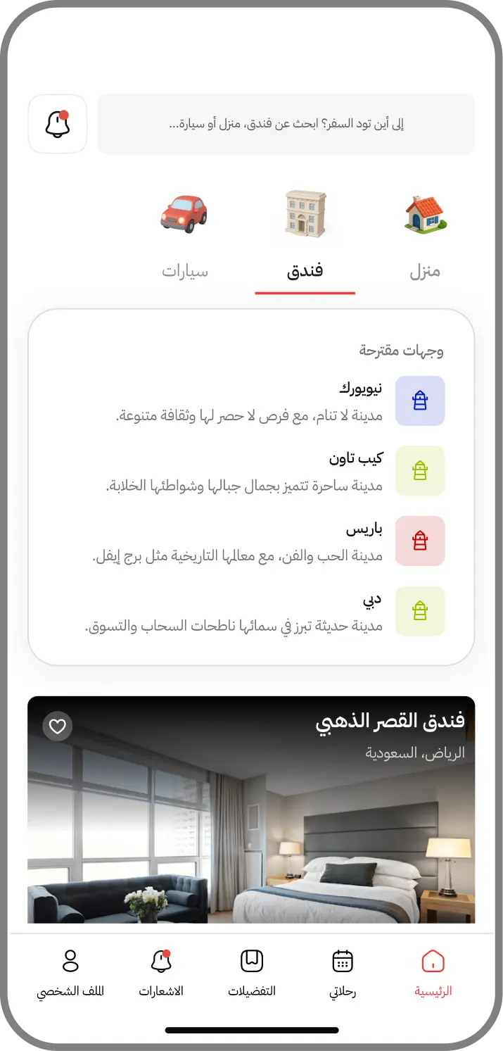
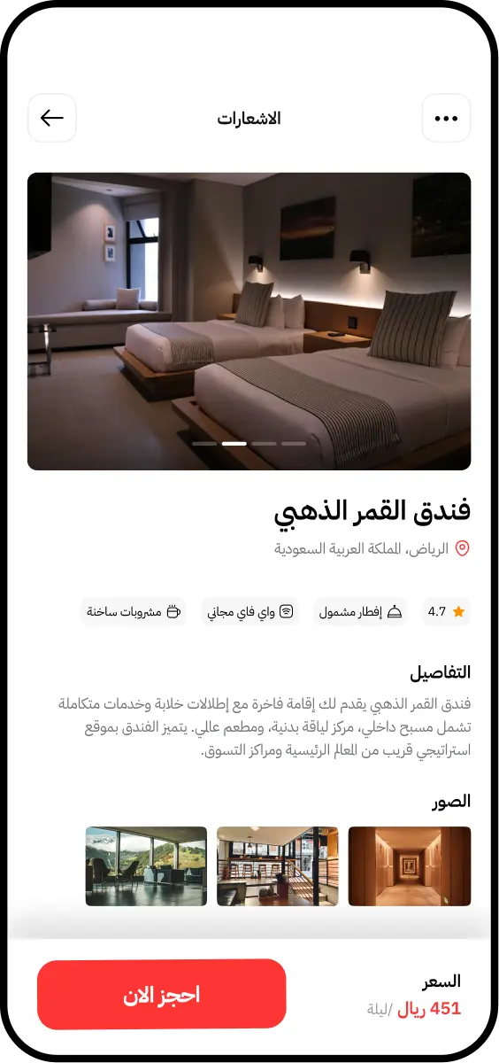
03 — Decision Making
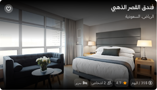
The first version opened the listing with price and rating, the way most travel products do. In Arabic that put a number at the exact point the eye lands, and the stay read as a transaction before it read as a place. Moving imagery to the top and holding price until the decision point fixed it. The same information, in a different order — but the order is the design.
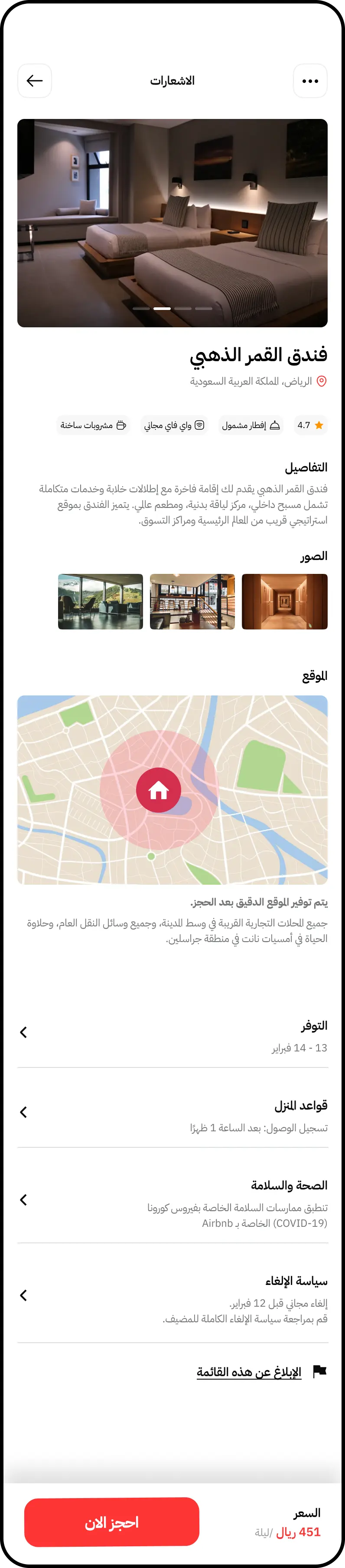
Imagery
Leads, because the first thing the eye meets sets the frame.
Amenities
Grouped for comparison, not listed for completeness.
Location
Placed after interest, before commitment.
Price & action
Held back until the decision is actually being made.
04 — Search & Control
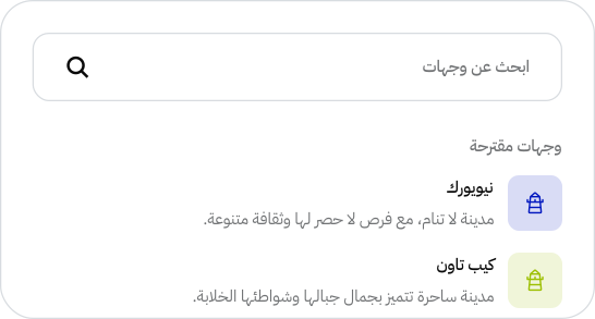
Utility screens are where RTL work usually breaks, because they're built last and inherit LTR assumptions. Filters that read as ranges, sliders with a low end and a high end, sort controls with an implied direction — each one needed a decision about whether its direction carried meaning or was just habit. Most were habit. The few that weren't are the ones that mattered.
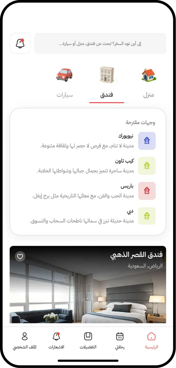
01 / Discover
Broad by default. Nothing is filtered until someone asks for it.
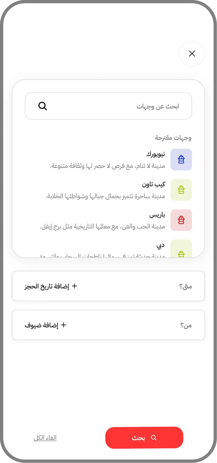
02 / Refine
Filters that read right-to-left without inverting their meaning.
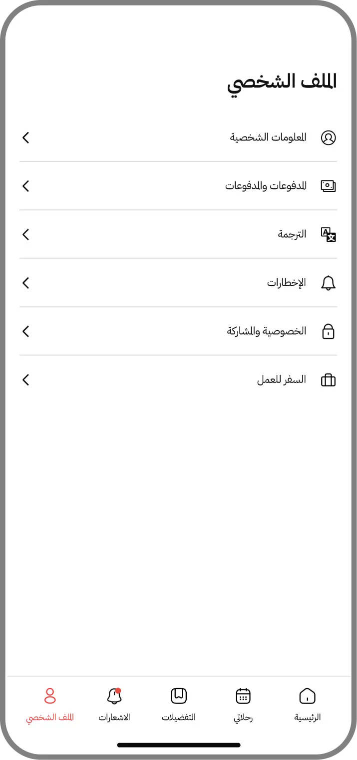
03 / Manage
Account controls kept conventional, because familiarity matters more than novelty here.
05 — RTL Details
These are the components where I had to decide, one at a time, whether an icon carried direction or just pointed. A back arrow is directional and must flip. A play button is not and must never flip — but both are arrows, and no automatic rule tells them apart. Mixed content was harder still: Arabic labels, Latin model numbers, and numerals reading left-to-right inside a right-to-left line, resolved field by field.
01 / Navigation
Directional icons flip. Non-directional ones stay put.
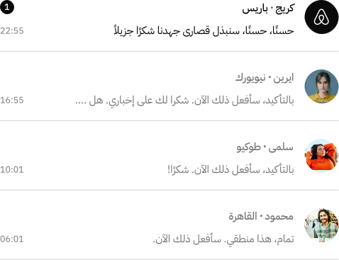
02 / Reading order
Hierarchy begins right, so emphasis had to be rebuilt, not mirrored.
03 / Controls
Utility patterns stay conventional; only their direction changes.
04 / Mixed content
Arabic, Latin, and numerals resolved per field rather than globally.
06 — Reflection
What I'd carry forward is that most of the work was decisions, not layouts. Perhaps a dozen small rulings — this icon flips, that one doesn't, this number reads left-to-right inside a right-to-left line — and each one is invisible when right and jarring when wrong. If I did this again I'd write those rules down first and design against them, rather than discovering them one screen at a time.