Bilingual · E-commerce · Client
Precision, Made Clear.
A bilingual catalogue for medical equipment, where the buyer is a specialist, the spend is significant, and the interface has to earn trust before it can sell anything.
Live site launching soon.
01 — Context
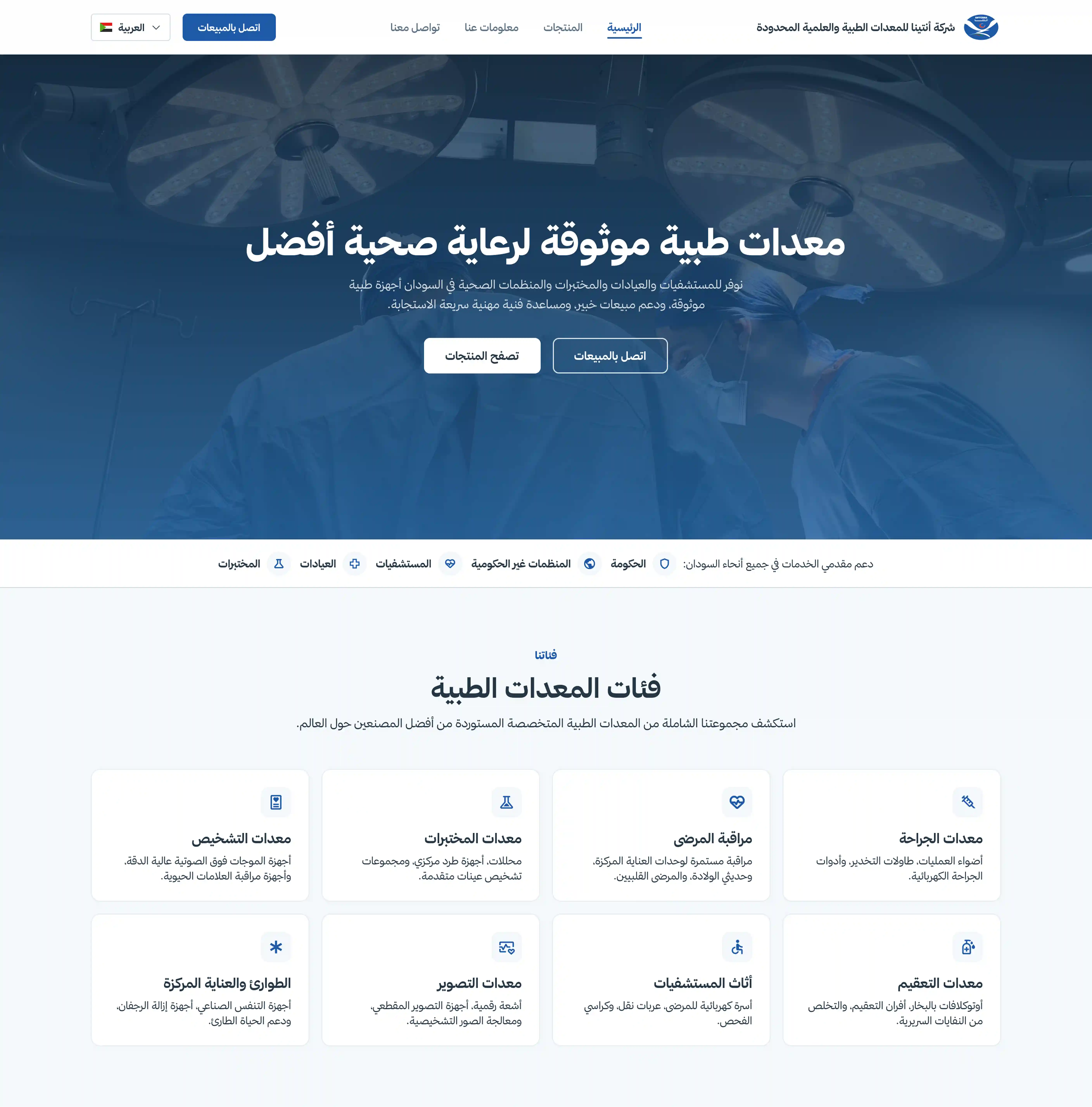
Technical products need clarity.
The people buying this equipment know more about it than any interface can tell them. They aren't browsing — they're verifying. That inverted the usual e-commerce approach: the job wasn't to persuade, it was to make specifications fast to find, easy to compare, and impossible to doubt. Anything that looked like marketing made the catalogue less credible, not more.
02 — Catalogue System
Making complexity browsable.
An early version gave each equipment category its own card treatment, on the logic that an imaging system and a surgical light aren't the same kind of object. It made the catalogue feel bespoke and impossible to scan — every category asked the eye to relearn where to look. One repeatable card, applied everywhere, turned out to be worth more than any of the individual layouts it replaced.
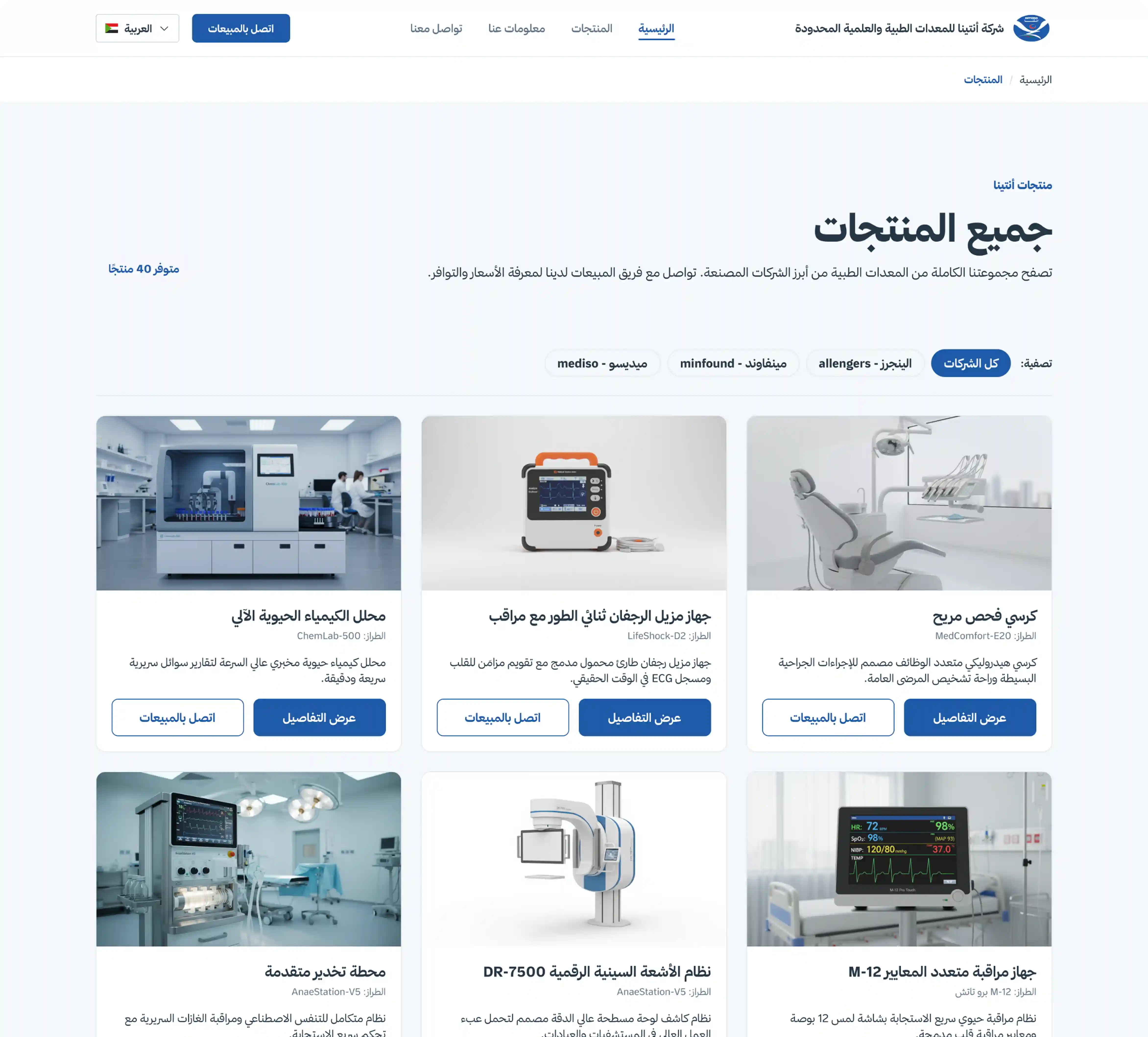
Catalogue structure
One layout, applied everywhere, so the range can grow without redesign.
Categories
Named the way buyers name them, not the way the business files them.
Product cards
Fixed hierarchy — image, name, category, action — so scanning becomes automatic.
03 — Product Information
Detail without overload.
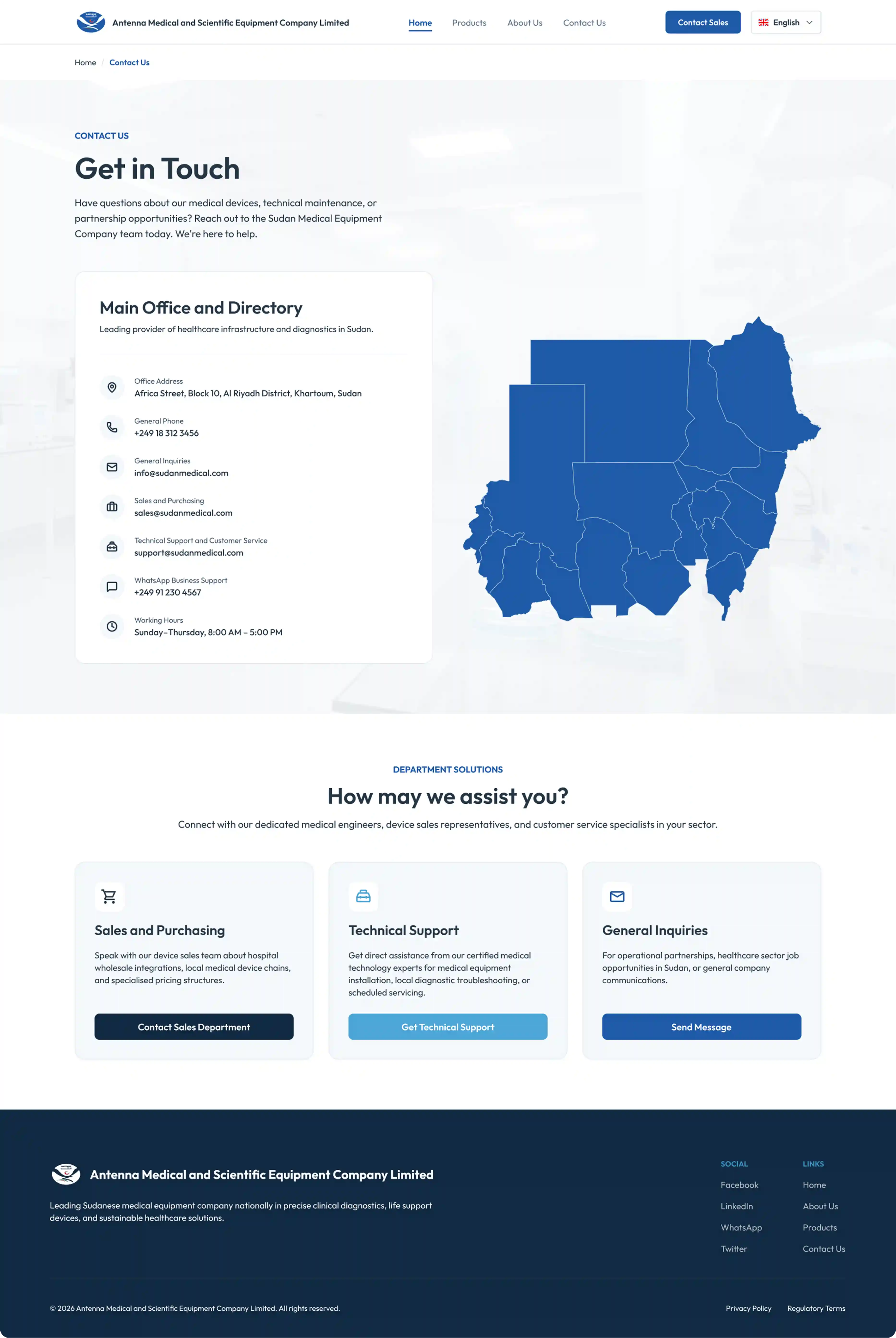
A specification sheet has forty fields and a buyer needs six of them, but which six depends entirely on who's asking. Rather than guess, I put the identifying details first and kept the full specification structured and immediately below — no tabs, no accordion hiding it. Someone who needs depth shouldn't have to hunt for it, and someone who doesn't shouldn't have to wade through it.
04 — Trust & Access
Confidence beyond the product.
In this category the purchase decision happens partly off the site. Buyers want to know who they'd be dealing with, whether support exists locally, and how fast a part arrives when something fails. Coverage, service, and contact aren't a footer concern here — they're part of the product information, and they're placed where the decision is actually being weighed.
05 — Bilingual System
One system. Two reading directions.
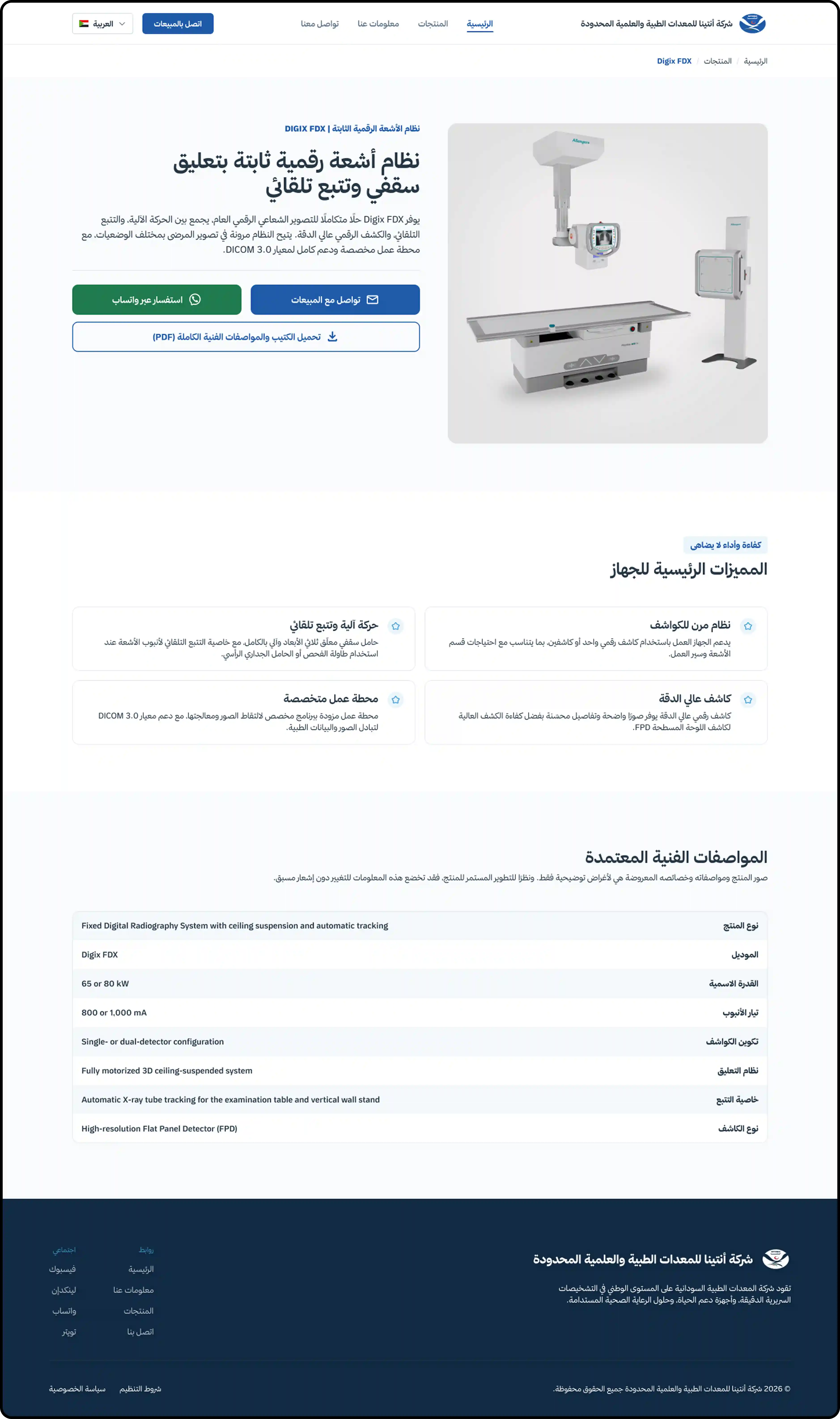
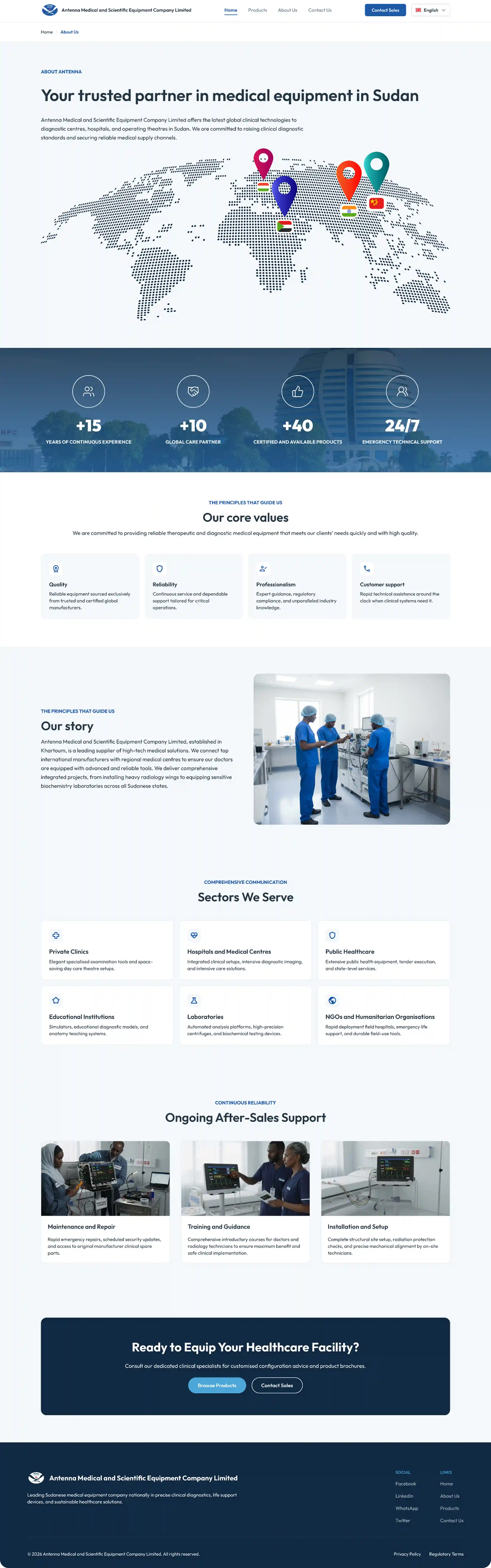
This is where the project became a systems problem rather than a design one. The same specification table renders right-to-left in Arabic and left-to-right in English, holding Arabic labels and Latin model numbers in the same row. Building two versions would have meant maintaining two versions forever. Instead the rules govern: which elements inherit direction, which are direction-neutral, how mixed content resolves. One system, two directions, no parallel maintenance.
EN / LTR ↔ AR / RTL

06 — Reflection
Clarity is part of credibility.
The lesson that transferred was about restraint. Every expressive decision I'd normally reach for — a bolder colour, a looser grid, a more characterful type choice — made this product feel less trustworthy in testing, not more. In a category where the buyer is an expert, the interface's job is to get out of the way convincingly. That's a harder brief than it sounds.