Empty states are usually treated as leftovers. A page has no data, so we add a line of copy, maybe an icon, and move on. But empty states often appear when someone is uncertain, new, blocked or deciding what to do next.
That makes them more than placeholders. They are small product moments with real emotional weight.
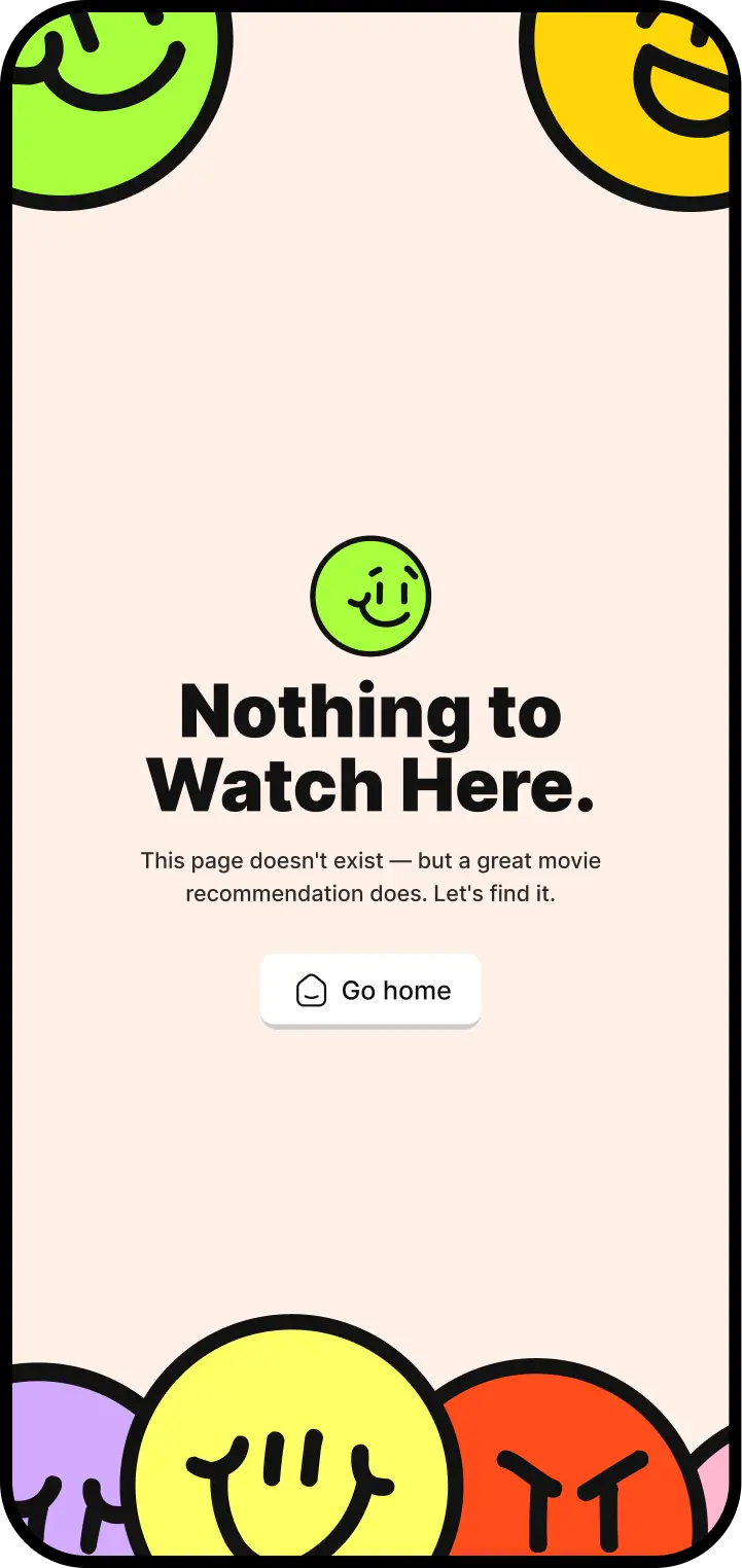
Start with the user's situation
A good empty state tells the user what happened, why it matters and what they can do next. The tone should match the context. A playful learning app can encourage. A medical equipment catalogue should be calm and practical.
The visual design can also carry hierarchy. The action should be obvious, the message should be short, and any illustration should support the state rather than fill space.
Small does not mean minor
The smaller the moment, the more precise it needs to be. Empty states are one of those places where product voice, visual system and interaction design quietly meet.