
A brand can be loud on a poster because a poster is one composition, seen once, in full.
An interface is not one composition. It is hundreds of states, seen repeatedly, at different sizes, holding content nobody has written yet. Personality that works in a launch image often falls apart in a form field.
The character has to survive the parts of the product nobody art-directs.

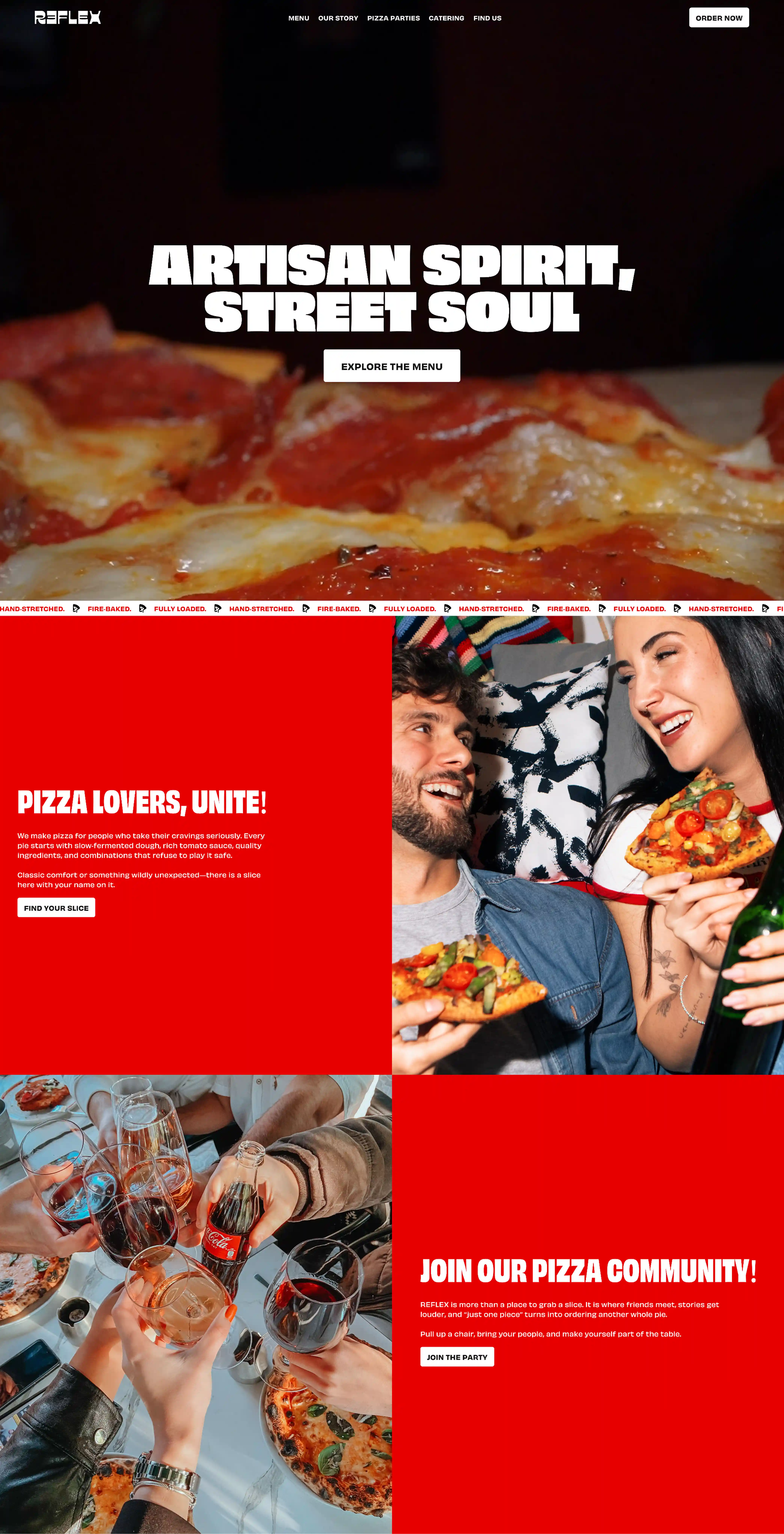
Where expressive brands break
Usually in the same three places.
Display type that is unreadable below a certain size, so the actual interface quietly reverts to a neutral typeface and the brand disappears exactly where people spend their time. High-contrast color used for emphasis everywhere, until nothing is emphasized. And a voice that is charming in a headline and exhausting in an error message.
Rules, not restraint
The fix is not to tone the brand down. It is to decide where the volume lives.
Loud in the hero, in headlines, in moments of celebration. Quiet in navigation, forms, tables, anything the user has to get through rather than enjoy. Written as rules - which type sizes carry the display face, which colors are structural and which are expressive, which states get voice and which get plain language - the personality survives contact with real content.
Character is a system property
The projects where brand and product feel like the same thing are not the ones with the strongest visual identity. They are the ones where somebody decided in advance how the identity behaves under pressure.
Expressive design is not the opposite of systematic design. It depends on it.