
The instinct when a screen feels heavy is to remove things.
Sometimes that is right. In editorial products it usually is not. A sports platform is supposed to carry a lot - features, results, long reads, quick updates, video - and stripping it back does not make it clearer. It makes it emptier and no easier to scan.
Density is fine. Undifferentiated density is not.

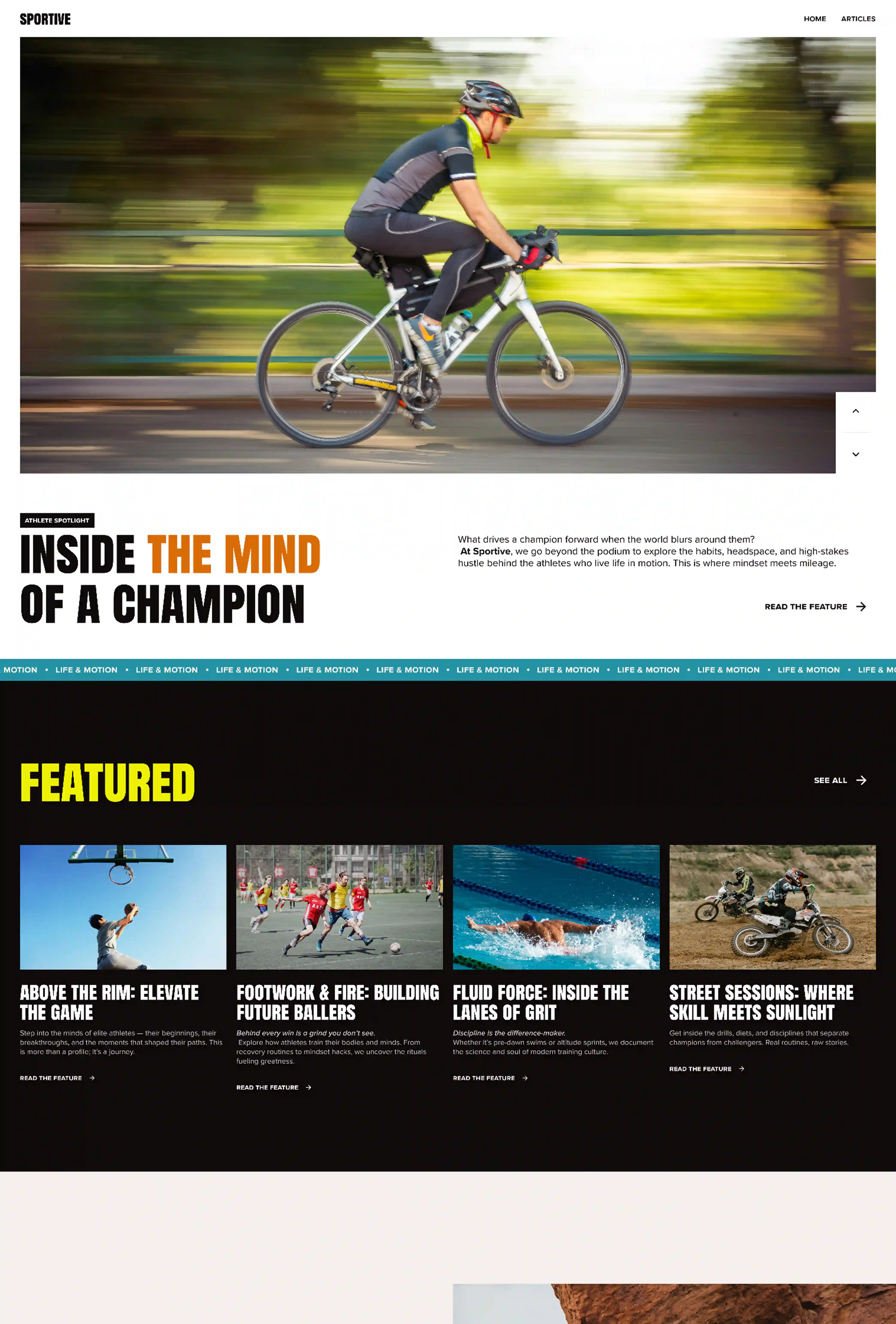
The problem is sameness
What makes a dense page hard to read is not the amount of content. It is that everything looks equally important.
Six stories at the same size, in the same treatment, in the same rhythm, gives the eye nowhere to land. Add one story at three times the scale and the same six become scannable - not because anything was removed, but because a hierarchy now exists.
Different content types need different shapes
A match result and a long-form profile are not the same object and should not share a card. One is scanned in a second, the other is committed to for ten minutes.
Beyond the Score used a small number of story shapes - hero feature, standard feature, related item, quick result - with fixed rules for each. The page can hold a great deal because every element announces what kind of thing it is before you read a word of it.
Space between, not less within
The other lever is rhythm. Dense blocks separated by real space read as sections. Dense blocks packed against each other read as noise.
Editorial design has known this for a century. The answer to a full page is rarely a shorter page.